


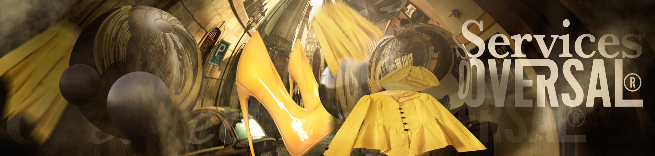

Our Services
What Can We Offer You?
Oversal Web Design is part of Oversal Media. We are a design and web development company that specializes in responsive content-managed websites and custom applications for the modern, multi-device web. Oversal Web Design was founded on the belief that great web design requires close collaboration between designers, illustrators, photographers, artists and developers throughout every stage of a project. We’re committed to helping move the web forward, and incorporating the most successful and future-friendly technologies in our work.
Bespoke Web Design

We create made to measure web design
High End Web Development

We provide cutting edge development
Sophisticated Graphic Design

We offer stunning graphic design
Outstanding Photography

We provide commercial photography
Since and forever – International approach to our work
Despite Oversal being located in London, England, we have an international approach to our work, giving us a unique position of being able to work with companies or individuals based around the world. We’re a company who offers stunning work that will showcase your company online and attract the customers you want. Our expert team of professionals specialize in e-commerce websites, brochure sites, content management systems, html animation, logos, and online marketing solutions. If you want to create a new site for your company or revamp an existing one, we have the creativity and marketing solutions for you. Get a quote today! Oversal Web Design has a very wide range of services, so with us you can rest assured that you’re online presence is being made the most of. Oversal Media is a design and web development agency that specializes in responsive content-managed websites and custom applications for the modern, multi-device web. Oversal Media was founded on the belief that great web design requires close collaboration between designers and developers throughout every stage of a project. We’re committed to helping move the web forward, and incorporating the most successful and future-friendly technologies in our work.
Branding Services

We provide branding services for small and large companies
Social Media Identity
We can create a social identity for your brand
E-Commerce
We provide bespoke e-commerce for small and large companies
E-Business

We can provide e-business platform for your company
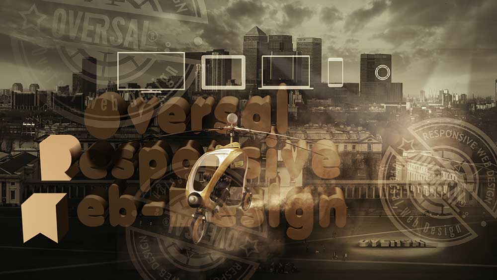
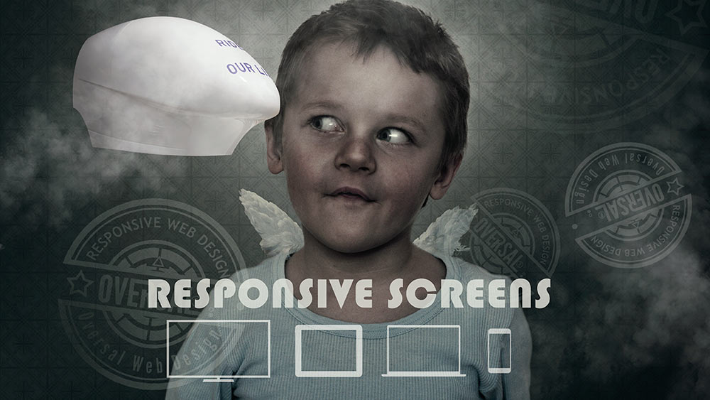
Standard responsive design
You’ve probably heard the term, “Responsive Design”; or, maybe, “Responsive Web Design”. Responsive Design is far more than a phrase. It’s the answer to a particularly challenge now facing all of us. Responsive web design has become the standard for most modern websites. Even though in the last few years the tools and techniques that generated this type of design have improved immensely, life can be difficult on the web. The problem is the ever-growing number of Internet capable screens of varied widths, heights, and higher and higher resolutions, most of which can change orientations and dimensions with the flip of a wrist. Now that the concept of re-size, flex, and rearrange depending on the view port of a device has become common knowledge, we can look beyond the idea itself to how best to implement it.
To Oversal Media, responsive web design is a process much like web design as a whole, and that process has some fundamental regularity. Here, the goal is to take advantage of the available space while preserving the feeling that whatever you’re seeing is always where it’s meant to be. The first regularity is mobile first. When we say mobile first, we are talking both about visual design and about code. In visual design, it means you start with the smallest screen, the vertical iPhone and design everything to fit comfortably within that framework. Once every piece is in place and everything looks natural, we can start scaling up to wider screens. We also need to take into account the viewer. How far away is the viewer from the screen? What is her most likely input device? And so on.
you’ve probably heard the term, “Responsive Design”. Or maybe, “Responsive Web Design”. Responsive Design is far more than a phrase. It’s the answer to a particularly challenge now facing all of us. Responsive web design has become the standard for most modern websites. Even if in the last few years the tools and techniques that made this type of design have improved immensely, life can be difficult on the web. The problem is the ever-growing number of internet capable screens of varied widths, heights, and higher and higher resolutions. Most of which can change orientations and dimensions with the flip of a wrist. Now that the concept of re-size, flex, and rearrange depending on the view port of a device has become common knowledge, we can look beyond the idea itself to how best to implement it.
To us, responsive web design is a process much like web design as a whole, and that process has some fundamental regularity. Here, the goal is to take advantage of the available space while preserving the feeling that whatever you’re seeing is always where it’s meant to be. The first regularity is mobile first. When we say mobile first, we are talking both about visual design and about code. In visual design, it means you start with the smallest screen, the vertical iPhone and design everything to fit comfortably within that framework. Once every piece is in place and everything looks natural, we can start scaling up to wider screens. We also need to take into account the viewer. How far away is we are from the screen? What is her most likely input device? And so on.
Responsive screens
On larger screens, we are likely to be positioned further away warranting bigger fonts, and we’ll be using a mouse so smaller buttons can be used. The same goes for code. Start by writing code for the smallest possible screen and use media queries to add extra styling for wider screens. But the most important benefit of writing your CSS mobile first, is that it produces less code. When you start with the mobile screen, you write the baseline styles that are going to be applied on all screen widths. On smaller screens, we are likely to get closer allowing the use of smaller fonts. But, we’ll be using our fingers for navigation which requires bigger buttons and links.
Code simplicity and mobile first makes better logical sense. In our responsive layouts we make sure that there are no predefined breakpoints. Even today, many designers still design and code their sites to hit specific breakpoints like the width of an iPad in horizontal or vertical mode. This is not a good practice for one simple reason. You don’t know anything about the device used to access your content. It could be an iPad, but it could just as easily be some random screen with a browser set at a random width. Or, it could be a new tablet or device not yet on the market. Case in point, the recently released iPhone introduced two new default screen sizes to the iOS browser. Rather than setting media query breakpoints based on the screens they will be presented on, set the breakpoints to display the content in the best possible way. That will likely mean your breakpoints will change depending on the element in question. But that also means your site will work better across all screens. We find the best way to achieve this is to work on components one at a time and find natural breakpoints for each. By using these principles to build our client’s websites you can rest assure that they tick all the positive points needed in today’s digital age.
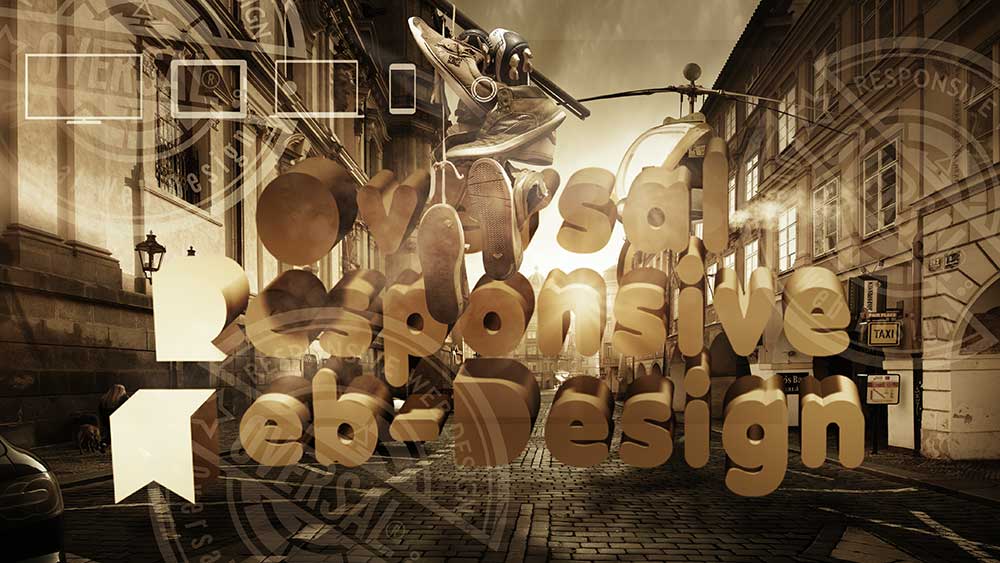
Oversal standard responsive design
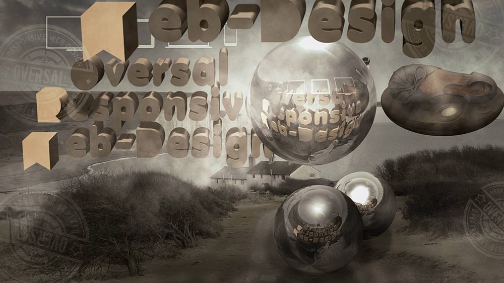
Oversal responsive screens
Require
E-Commerce
Services?
Get in touch to start your e-commerce Store!
Our Design Guarantee covers all of our web design. Simply put, we’ll work hard to meet your expectations.
If you’re choosing a web design agency, it helps to know more than just the costs, their clients and the work they’d do for you. So here are a few things about the way Oversal works.

All of our websites are hand-coded from scratch to ensure that they are as optimized as possible for Google from day one. With a new website from Plug and Play our customers regularly go from no-where to Page 1 of Google with no additional Search Engine Optimization in under a month. As with anything, the more competitive the keywords the more likely that you’ll need additional SEO work post-launch to achieve higher results – do ask for more information.
Unlimited Service
We like to think that our service is second to none. You’ll have a dedicated account manager and the support of our head office too, so you’ll always be able to talk to a real person who knows what they’re doing straight away. Now and in the future, whether you need more features or have simply forgotten how to do something in your Content Management System, we’re here for you as long as your website is.
How we run projects
We don’t adhere to formal, complex project management systems, but like most IT companies we loosely follow the ‘agile’ model. We conduct an iterative process, constantly amending and responding quickly to feedback and ideas from our clients, their users and other factors that require change. Another guiding philosophy is David Allen’s Getting Things Done, in which a central thesis is that, while our brains are good at making decisions, they’re not so good at remembering things we need to do. So using systems and tools to aid our memories and ensure that things aren’t forgotten, confident that decisions are put into practice and projects completed. In our case, we use the leading project management and collaboration tool Basecamp. It was designed by a web agency of around our size with our kind of needs, and we’ve found it a natural fit. We don’t force our clients to use it, but they’re all welcome to, and most see the benefits immediately.
Checklists and threaded discussion
Oversal Video Conferencing Boot Camp

Oversal Boot Camp has many benefits but the most important is the discussion of our projects. We ran many projects for years conducted entirely over video conferencing where one request from a client would be in one e-mail and answered by us using video conferencing. Each individual request you have however big or small, will be answered. Questions about an element can be asked in a thread attached to that element and not mixed up with others. The element can be assigned to an individual person and have a deadline attached to it, quite apart from bigger project deadlines. And when it’s done, it gets checked off by us. Clients and developers login to see and comment on the same checklists and everyone can be sure that nothing gets forgotten and everyone knows what the latest information is.
Time Planning
We don’t spend a long time developing wordy project specification documents, adding the time to your estimate. We agree a clear, concise list of the things you’re asking for in a project. Using your details we will have an idea of what is needed to provide the best services. Our checklists will become our project plan. We aim to provide service that is flexible, collaborative, ever-changing, but ever-accurate.
Additional Testing
It’s perfectly possible to test everything as you go along, after every significant addition or change is made to the site, but it adds to the time and the cost of the project. Some clients prefer it to be done in one specific period of time. But websites must be tested before they’re launched to make sure that they display well on all leading browsers, on different platforms and devices; that users find what they’re looking for and don’t get frustrated with registration forms; that hyperlinks work and code doesn’t fail; and so on. There are many different ways of organising testing and we’re comfortable with most of them: using external companies, planning in-house testing at our end, or using you and your colleagues to test our work. The one thing we believe is that the best testers are people who think like your website users, not like web developers. We always plan for a ‘sacred’ period of testing at the end of the project, after all possible changes have been made to the site, all content added, and all design polishing complete, giving us good time to run a series of automated tests and have human beings sense-check the site pages.

Most projects require a certain amount of customization, a typical project might look like this:
1. Discovery and analysis. Learning about your company and product/service, figuring out the goals of the design project, and planning a set of deliverables.
2. Proposal. From the discovery, generate a proposal to address your requirements. If you’re happy with it, we commit to working together.
3. Initial design. Taking what’s been learned in the previous steps and coming up with an initial set of mockups that address as many of those issues as possible.
4. Feedback and refinement. A predetermined number of rounds where you provide feedback, I make revisions to the initial design, you provide more feedback, I revise more, etc. Repeat until we’re all happy, or the predetermined rounds end, whichever come first. (And of course, in the latter instance, we’d talk about further work if it comes to that. Lucky for all of us, it rarely does.)
5. Coding and implementation. Once the design is finalized, we build out the templates and someone implements them. (Sometimes that someone is Oversal, often it’s you or your people.) In many projects, at this point there will be further changes to the initial templates that require extra work; these usually come in the form of extra pages, templates, or content styling that come about after the initial deliverables have been determined. It’s common that we don’t have a clear picture of everything that is needed at the beginning of the project, and closer to the end that becomes much clearer.
6. Final Pass. After everything’s “done”, we do a quick review to make sure it all looks and works the way it should.
How quickly can I get it done?
But keep in mind this is a general guideline. Once started, most projects tend to dictate their own process. And that’s okay too. A comfortable time frame is somewhere between one and three months from start to finish, and a month or two of lead time before kicking it off is always good. The words “tight timeline” usually mean I have to pass, but never say never. If your project is particularly attractive and I have an appropriately-sized hole in my schedule, things may be more flexible.
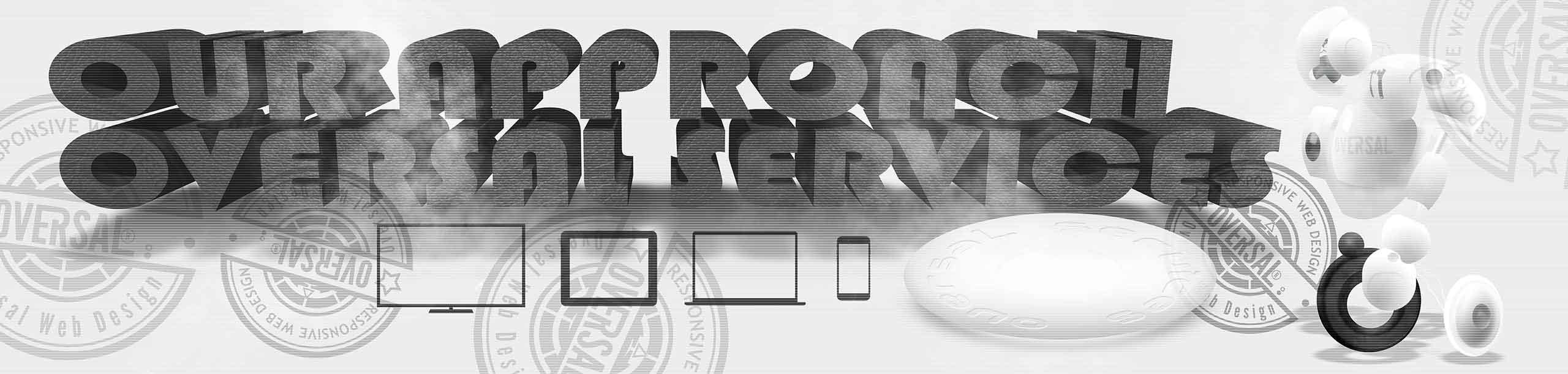
Our Approach
When it comes to managing web projects, we’ve picked up a thing or two over the years. So, what should you expect when you hire us? What follows is a brief summary of the life of a project here at Oversal Web Design.
Project phases
1 Enquiry. It all starts when we get that first call or email from you. We are very friendly and approachable, and no question or idea is dismissed out-of-hand. If you have a good idea of what you want to achieve and a budget in mind, feel free to ( get in touch LINK ) We think we’re pretty flexible as we’ve worked with small outfits all the way up to blue-chip corporate businesses.
2 Initial proposal and guideline prices. We’ve been doing this for a while so chances are we’ve previously built a website similar to what you’re after and we’ll be able to use that as a guide in order to put together an initial proposal and rough estimate. It’s not just about prices though: we like to meet up at this stage so you can get a feel for our company. It’s important that we’re the right fit for each other. We think we’re pretty flexible as we’ve worked with one-man-bands and small businesses, all the way up to blue-chip corporate businesses.
3 Project specification. At this stage we’ll identify the results you are looking to achieve and discuss how your website / web application will deliver them. Where possible we’ll collect any content and collateral for your website so that we can draw up a site structure. It depends on the project but often, rather than spend a lot of time and effort writing long-winded specification documents, we tend to produce a ‘wireframe’ prototype to identify the key features and how they will fit together.
4 Design phase. We will produce provisional designs to convey the general look and feel for your website. Often there are a number of rounds of feedback and tweaks before the design is signed-off. Typically we do not design every page of the website as this would prove time consuming and costly. We will use the provisional designs as a style guide that can be applied consistently throughout the site, and will adapt the page layouts to fit their content.
5 Development phase. We like to work with open source server-side technologies including Ruby on Rails, PHP, MySQL allowing us to deliver projects on shorter deadlines without compromising the quality of our work. (Read more about….).
6 Testing, feedback and amendments. Once we have an initial implementation to show you we will make it available for you to test online before it is visible to the public. We’ll ask for your feedback at regular intervals so that we can make any changes and amendments before too much time and effort has been invested.
7 Go live! The website (or application) is finished and ready to be launched — All that remains is to hit the button!
8 Review, analyze and improve. All websites have a ‘bedding in’ period shortly after they are launched and during this time we will monitor your website, fix any bugs and make the inevitable tweaks and changes you require once you start using it in earnest. This is also the time to further review your site’s performance on search engine results pages.