


The Brand Development
We Call Evolution
Once upon a time, there was a company named Oversal. They lived at the edge of London with their employees. One morning, while they were designing websites, Oversal wandered into the big city and found their creative potential.
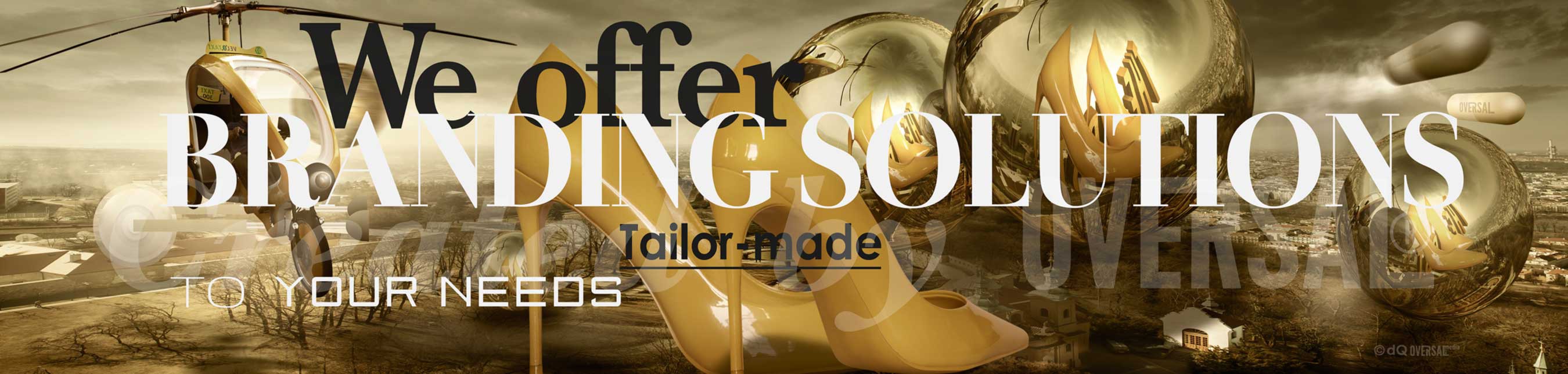
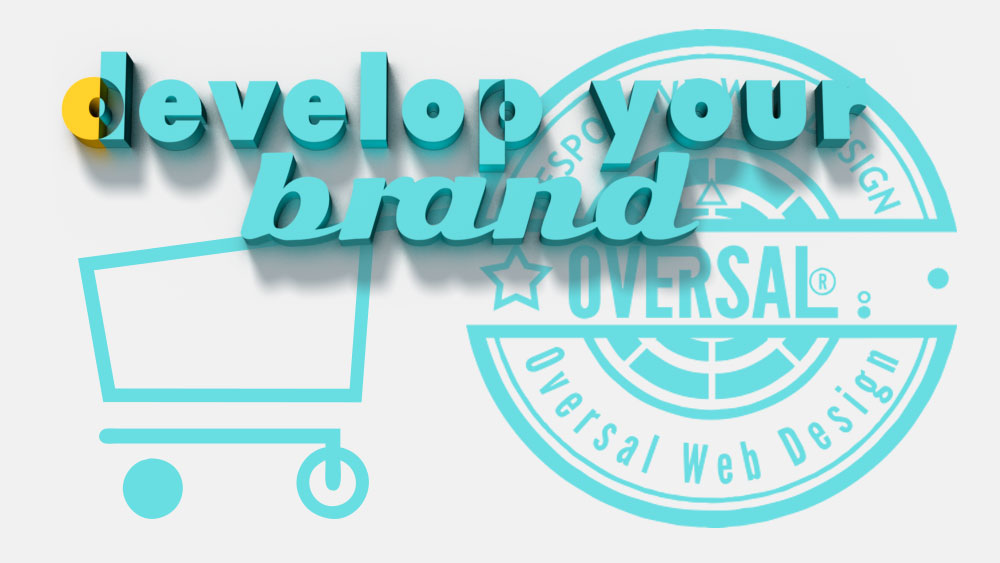
Develop Your Brand!
Building An Effective Image
Oversal Coordinated Approach
A coordinated approach to your corporate design needs to be taken if you are going to effectively build a new brand. Oversal Web Design is adept at creating and developing bands in all on and offline mediums. Our flexible approach to website design gives your business the best start it can achieve in a challenging and ever-changing sector. The kind of website design some firms usually offer can be limited compared to the multifaceted services we are renowned for.
Oversal Web Design may be a web design company, but we specialize in more than just website design. We have a broad range of related services including web development, print design, branding design, illustration agency, packaging design, web applications, flash design, html design, e-commerce platform development, and online marketing. If any of these areas interest you then don’t hesitate to contact one of our web design agency consultants to discuss your requirements. Content management systems allow you update your site easily and grow it yourself. We offer cms training with every content-managed website.
Let us make your site!
Market your products or brand with us
Generate new business with our professional website services
Develop Your Brand With Oversal
We offer affordable website design solutions
You don’t need telling how powerful the web is as a channel to market your products or brand. Arguably it’s the single most measurable and flexible way to communicate with your clients and prospects. Whether you seek a simple online presence that provides a shop window to the world or a far more complex website Oversal Web Design has a solution for you. Irrespective of its functionality, your website needs to grab the user, open quickly, be simple to navigate and should lead the user to make contact or make a purchase. We offer affordable website design solutions. We can design a website that will generate new business and present your company with a professional, successful image. It’s a very competitive world we live in today and a quality website is one of the most important acquisitions for any business. A high quality, professional web design will indicate a professional, high quality company.
All Oversal Web Design website designs are individual, one-off and based on your exact requirements. Your design shouldn’t stand between your customers and your service. We strongly believe in the power of great design to help communicate your message, and we have the technical expertise to enhance that.
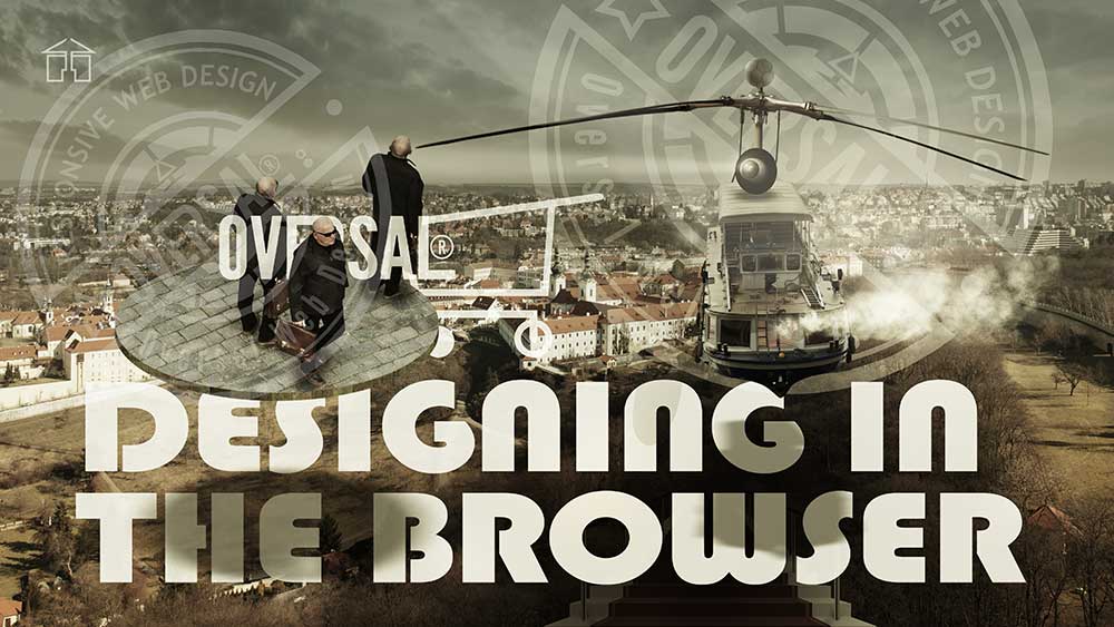
Image of designing in the browser
DESIGNING IN THE BROWSER
Design for the medium
The actual job of designing your site across all possible screen widths is best done in the browser. We design for the medium the final product will be presented in, and that medium is the browser. In practical terms this means we build the design from the ground up just as we do with content and accessibility: one piece at a time, in code. To web designers who are used to doing the visual design in Photoshop and then transporting it over to an IDE, this will be a bit of a transition. That said, there are major benefits to the in-browser design process that will make you less dependent on Photoshop in a very short time. And of course you can still use other design tools to help this process along, especially to make mock-ups for clients. But the majority of our design work should be done in the browser. Our method involves starting from the global and moving in towards the local before focusing in on individual components and elements.
Image Of Initial Ideas
INITIAL IDEAS
Information Architecture Hierarchy
If it turns out your initial ideas don’t work as well in the browser as you originally envisioned, we simply find what works and augment the style guide to reflect the change. With global elements styled we typically move on to main layouts. Here it’s important to follow the already established content priority hierarchy and information architecture closely, to ensure the work done in the content strategy phase pays off. Style layouts for the mobile screen first and add media queries as necessary to account for wider screens. Because we typically work with content management systems we physically separate all layout styles and place them in their own style sheets. That way we can have multiple layout style sheets for different types of views, and those style sheets can be called in dynamically to achieve multiple layouts with one main style sheet handling everything else.
Working With Responsive Images
WORKING WITH RESPONSIVE IMAGES
Modern Image Techniques And Technologies
The final piece of the build phase puzzle is responsive images and graphics. This is an area where the web design world is undergoing a significant shift and staying at the cutting edge of these developments will put you and your project well ahead of the competition. When adding images and graphics to your site, you should, whenever possible, utilize modern techniques and technologies. These improve load and rendering time and lessen the volume of data that needs to travel from the server to the visiting device while still retaining the highest quality image possible. Let’s take a look at three techniques and technologies that will make your images and graphics truly responsive. Out-of-the-box images are static elements. They have a fixed width and height and are best displayed at their native size and resolution. The nature of the screens on which they will be displayed is the opposite. Screens have an almost infinite variation of sizes and resolutions also vary greatly. Our challenge is to find a way of serving every visiting device for the image that best suits the screen size resolution and bandwidth restrictions. To conquer this challenge, we have the new source set and sizes attributes for the image element as well as the picture element. Combined, these allow us to serve up different image files depending on screen size, resolution, and bandwidth to meet the demands of the modern browser market. Using these new tools also allows us to rethink images on the web.
Screen Display Variety
SCREEN DISPLAY VARIETY
Scalable Image Technique
Because we literally serve up different images depending on the screen they are displayed on, we can also customize those images themselves to fit those particular screens. Maybe a large screen would get the whole image while the smaller one would get a cropped image with only the important details. This is a new area of expertise where web design and art direction techniques more commonly attributed to magazine design finally merge. It’s exciting and worth diving into headfirst. Source set sizes and the picture element is for regular images, but web graphics often use computer-generated images and icons. For these, we have other options. For icons, we can now use custom icon fonts. These graphics allow us to apply font-specific CSS to flat icons and serve up scalable icons that look crisp and clear on all screens and all resolutions, and because they are fonts, they are light to load and easy to render for the web browser. For more complex graphics and animations, we can now use scalable vector graphics or SVG’s. The amazing thing about these graphics is that they are individual XML documents that draw lines and curves based on numbers and mathematical formulas. That means we can style their individual elements using CSS and, more impressively, interact with them and change them using JavaScript. We’re truly entering a brave new world of web design and these techniques and technologies open the door for almost unlimited possibilities.

A Look Of The Modern SEO
A LOOK OF THE MODERN SEO
SEO Shortcuts Dont Work
SEO or Search Engine Optimization. Historically, this meant rigging your code in a certain way to gain the search engines into getting better ratings. This is no longer the case. There is no silver bullet or magical piece of code that will instantly get you ranked higher on search engines. Instead, the search engines index your site based on some familiar attributes: Quality of Content and “trust factor”, Accessibility, Load Time, and Quality of Code. This is good news for you as a web designer because as you can see from the list these are all things we’ve been focusing on in this course. In other words, by following the web design process we’ve laid out here, your site will already meet the baseline for Search Engine Optimization. This is especially true for accessibility. Search engines are blind and the more accessible you make your site the easier it will be for them to index your content. That doesn’t mean you can’t do more, though. To fully optimize your site for search engines, here are a few tips. First, add alternate texts to your images, where appropriate.

Working With The Engine
WORKING WITH THE ENGINE
Our Optimization Activity
This text will be indexed by search engines and your images and, by proxy, your site will show up in image searches. Second, add further image descriptions to attachment pages where available. In Word Press, and other content management systems, every media item has an attachment page. These pages normally allow the site owner to add further information to the media item. Add relevant information and it will be indexed and found on search engines. Third, submit dynamic sitemaps to Google and Bing for more accurate indexing. These can be generated using third party tools or in the case of CMSs, through plugins or extensions. Fourth, activate Google and Bing Webmaster tools, and Alexa, and Pinterest site verification. These tools will help you keep closer track of how your site is being tracked by these services and also alert you if something is amiss. And finally, fifth, write great content. In the end that’s all that really matters. You can dive further into the world of Search Engine Optimization by checking out our various courses on SEO right here in the lynda.com library.
Let Us Make You A Fantastic Website
What are we going to do for you
Statistics and Analytics
We install Google Analytic on every site, so you can track where your visitors come from, where they go on your site and what actions they take. And when you know what works, you can improve your website.
SEO, Search Friendly
Flawless build quality, W3C-compliant coding and site maps that automatically update when you add new content all help to make our websites search engine favorites.
Our Design Solution
Before we can effectively work together, we have to make sure we understand each other’s goals. We need to be able to explain what we want from each other so we can then make the right choices. The question is: how do you make good choices? As we create a website we need to figure out what color combination, font, and navigation bar we will use. To answer all of these questions we need to ask another question.
What do we want to achieve with this website?
Good design has a purpose, it solves an aesthetic problem, it can change our mood or the way we feel. It is driven by aesthetics and personal preferences. However, the main purpose in design comes from two primary concerns: appearance and functionality. Appearance isn’t just about logos, letterhead and marketing reports. A good design defines the core concerns for an organization and lays the groundwork for all projects to come. Design deals with questions of who we are talking to, what are we trying to say, and how can we say it to best communicate and connect with our audience? Answer these questions well and you’re on your way to creating successful designs. To determine purpose of our task ahead we need a good solid project definition. In other words, what’s the point of creating a website? How will the world benefit once it’s finished? Ultimately it should be to achieve something positive. It doesn’t say how we’re going to do it, but it lets us know what we’re going to accomplish. And as we write the rest of the goals, and later work through the project itself, we can always refer back to this section to see if what we’re doing is supporting our central goals. If not, it’s probably time to rethink what we’re doing.
Gold Package Deal
For people who want to have a professional website
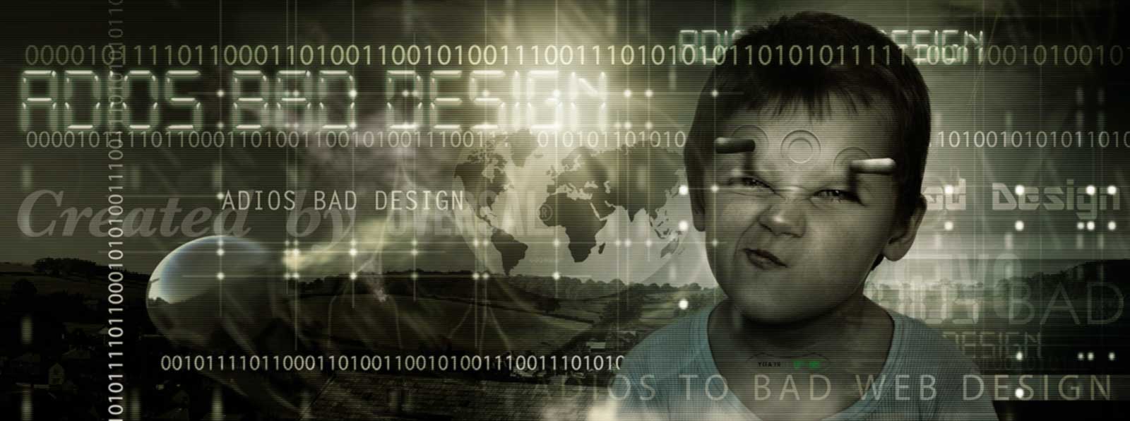
Adios To Bad Design
Defining the projects
Once the project’s aim is established, we can start defining features that will help us achieve those goals. Defining the project this way before we jump into designing things makes sure we’re actually designing the right project. But how do we figure out what the purpose of the website is, anyway? One of the great mistakes of designers are that they are often ignorant of the profession they’re designing for. Whether it’s an art gallery, a charity organization, a shoe factory or a car engine manufacturing or a university – they don’t really know the first thing about their organization or industry. Luckily for us we have at our disposal a very special contributor to help us with this part of the process: our clients.
Solutions
You don’t need telling how powerful the web is as a channel to market. Arguably it’s the single most measurable and flexible way to communicate with your clients and prospects. Whether you seek a simple online presence that provides a shop window to the world or a far more complex website Oversal web design has a solution for you. Irrespective of its functionality, your website needs to grab the user, open quickly, be simple to navigate and should lead the user to make contact or make a purchase. We offer affordable website design solutions to help you achieve that.
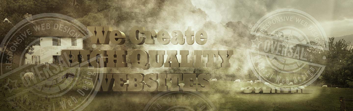
We Create High quality websites
Let us help you to generate new business!
Design success
Competitive websites
Quality websites
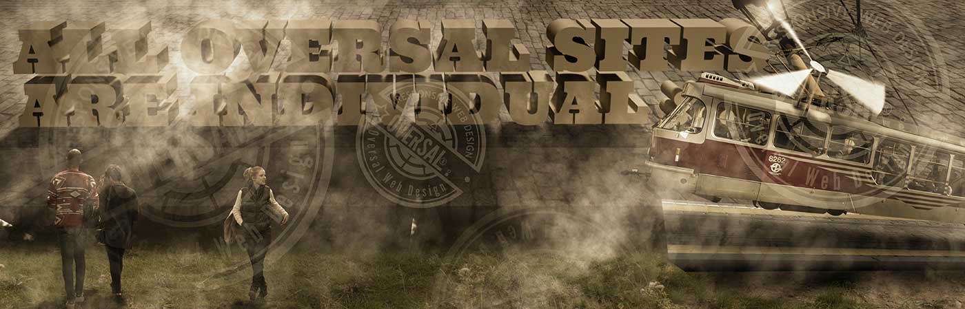
All Oversal websites are individual
Our tools for broadening your clientele
One-off and based on your exact requirements. Your design shouldn’t stand between your customers and your service. We strongly believe in the power of great design to help communicate your message, and we have the technical expertise to enhance that. Websites and social networking have become the most crucial tools in broadening your clientele. It is often the customer’s first impression of your brand. It is therefore important that it be portrayed professionally through all types of media. Equipped with a fresh creative outlook and the latest web standards, we can make your brand well represented in any browser, whether on a PC or a mobile device.
Why your business needs an accessible website
Aside from keeping your business in good stead within the law, there are other benefits to be had with an accessible website. To start with you will be opening your website up to a much wider audience. If your competitors haven’t bothered to consider this law then you will find yourself ahead of the competition in this area.
Another benefit is that it can help with SEO, significantly! There have been many cases where the search engine rankings of a website have improved once accessibility standards have been met. Search engines seek to provide high quality search results to users, so are more likely to pick a site that all people can enjoy over one that is selective in its audience. Accessible websites demand higher quality coding and thus you end up with a higher quality solution, which is achieved by adhering to the standards set out by governing bodies on the Internet. The search engines use automated bots to read your websites contents, it is thus easier for these bots to read your content if the solution adheres to standards; thus an accessible website is easier for the search engine bots to read and index.